When COS Design began working with LaproSurge the ambition was clear: to build a brand that communicated surgical expertise with confidence and coherence. We partnered closely to define an identity that would grow with the business and support it in a fast-evolving international medical marketplace.
From strategic branding to day-to-day communications, our relationship has grown into a long-term creative partnership. Today, we continue to support LaproSurge and its family of brands with targeted design ensuring every touchpoint feels connected and professional.

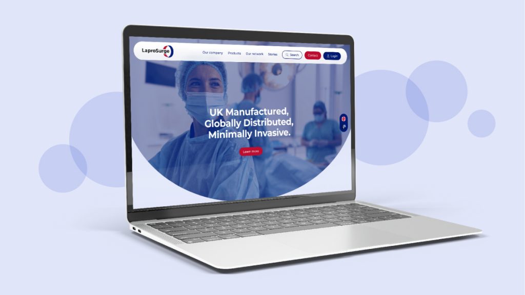
Defining a confident identity
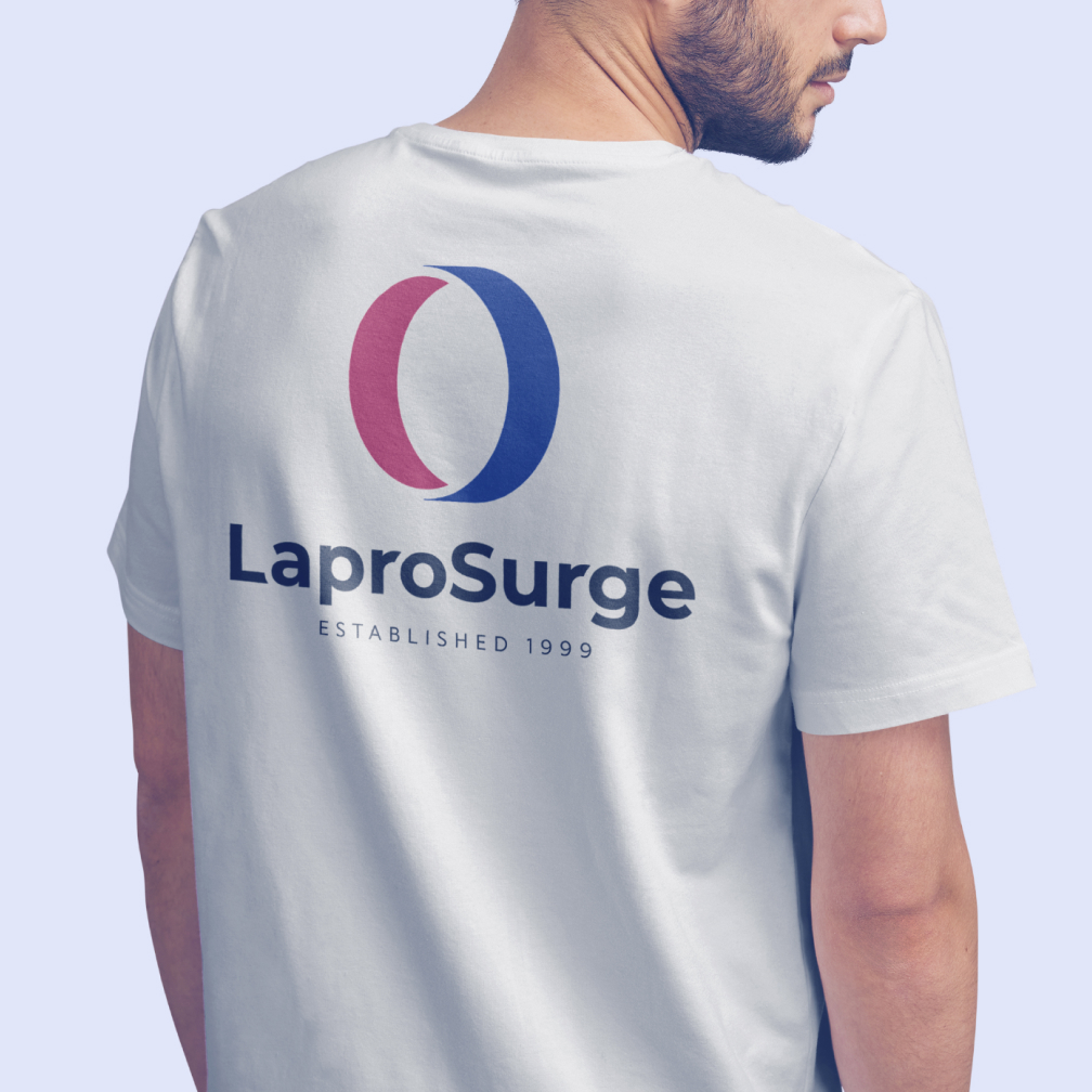
We created LaproSurge’s brand from the ground up. Building on the supplied logo design we developed a visual language and comprehensive brand guidelines. Balancing clinical trust with simple design, ensuring flexibility for future growth. The result is a distinctive identity system that communicates reliability, innovation and professionalism across print, digital and physical environments.


Clarity across complex product ranges
We designed brochures, illustrated procedure packs and product guides that make highly technical content accessible. Through careful layout and content hierarchy we transformed detailed information into clear and engaging communication tools. Each asset supports understanding, strengthens credibility and showcases the quality behind LaproSurge’s expanding product portfolio.
Bringing the brand to life
From supergraphics and signage at their head office to exhibition graphics and pull-up banners, we translated the brand into large-scale environments. These physical expressions of the brand reinforce recognition, strengthen presence at international events and ensure LaproSurge stands out within competitive exhibition spaces.